
It’s been a hot minute since I last posted about my bujo on here! Well, we have been banned from doing anything so my bujo hasn’t been able to do it’s job of being a diary, that that might explain it. Still, this autumn I made a conscience effort to utilise my bullet journal once more, for both work and day to day activities. If you are reading this with a blank face and thinking “what the heck is a bujo? Oh no, she’s not talking about Boris Johnson is she?”, have no fear; check out my Bujo-ing for Beginners post, and all will be made clear. If you are up to date on your bujo lingo, or just want to see some pretty pictures, let’s dive straight in!

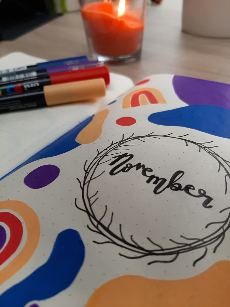
Straight away, you can see I am a dots for boxes kind of gal, and I have been for quite a while. This lovely burnt orange bujo is from the eco-friendly company Dingbats and was actually a gift from my fiancé (+10 fiancé points to him). It’s got a pretty good paper thickness meaning minimal ghosting with fineliners and felt tip pens. I have noticed that acrylic paint (like in the Posca Pens I use religiously) sit a little heavy on the page, but they never bleed through.

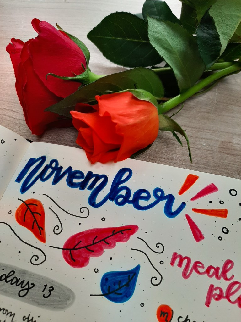
This month, I went with a seventies meets autumn theme, mainly inspired by the four colours I chose; a lovely deep blue and purple, with a pop of red and pastel orange for the November vibes. Another inspiration was found on Instagram and TikTok; I’ve noticed a lot of the ~cool~ people online have tonal hangings of rainbows or have a similar print on pillows or on their walls. I’m not ~cool~ enough to know where these items came from (I’m guessing Urban Outfitters), but I loved the idea, so made the tonal rainbow a big fixture of my spreads.
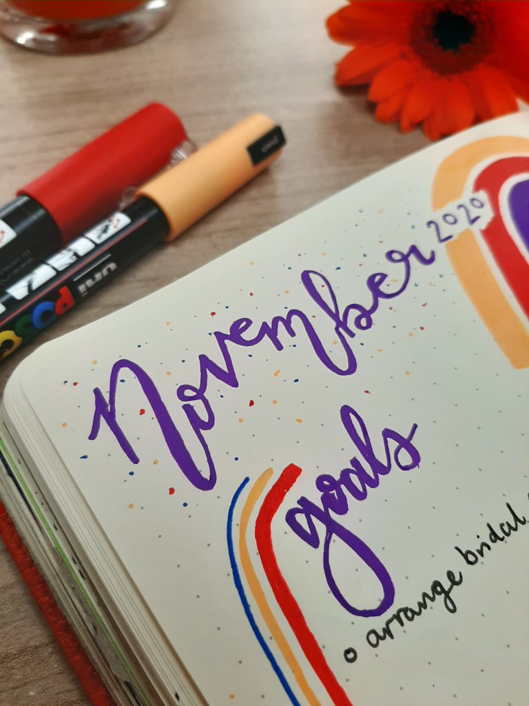
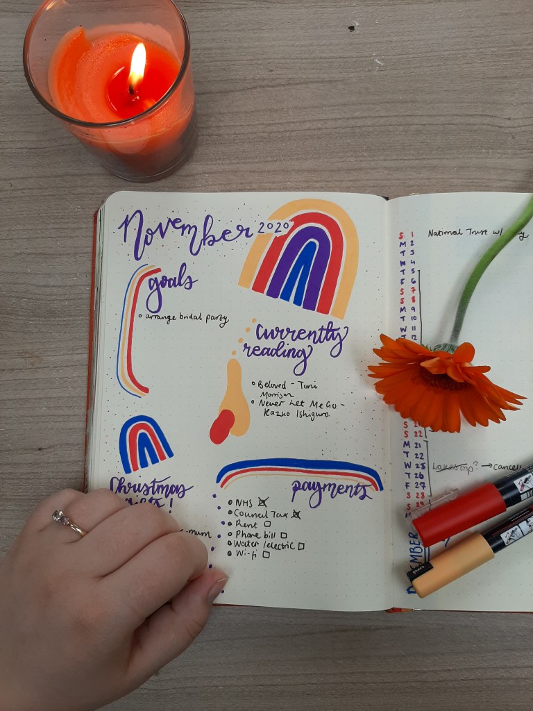
As per usual, I start with a normal title page, just showing the name of the month and introducing the theme. We then move in to my November Goals spread. Normally, this is a double spread; goals and to do’s on the left side, single column diary on the right. I did have quite a lot planned for November, including a family trip to the Lake District, some socially distanced bridal trips, and walks in my local area. Buuuuut then we were hit with Lockdown 2.0 and my plans were rightfully scuppered. Still, you can see I have been getting some use of my November goals spread (which reminds me, I need to update my list under the Goals title – I might be at home this month but I’ve still got goals to hit!)
Then, we move on to trackers. I’ve played around a multitude of trackers in my time ranging from workout to sleep trackers, and gratitude and saving trackers. But, the only ones that have stuck have been my Mood Tracker and my Habit Tracker. This month, I actually tried something new and went for a circular mood tracker! I know it looks pretty basic, but maybe basic is best. Normally, I painstakingly draw out little books or plants to colour in, but I always forget to fill it in. I’ve been getting on pretty well with my wonky circle, so yay for trying new things! For the habit tracker, I stuck with my tried and true method of colouring in the box when I’m done with the task. Easy-peasy. I track anything from my skin care, medications, workouts, and creativity; anything that I think will have a positive impact on my day to day life.

And then we come to my favourite bit; the weekly spreads! In my first one, this is where the Seventies theme reaaaaally hits. Inspired by a lot of vintage adverts that us long lines and trios of colours, I stuck this excellent postcard from Paperchase down, and just went wild. I love the contrast of the purples against the mustard-y yellow, especially as they are opposites on the colour wheels, and the *pop* the red brings. I only noted down my dinner plan and a small to do list amongst the spread, as I think this spread was all about balancing simplicity with the bright colours. I genuinely think this is one of the favourite spreads I have ever made.
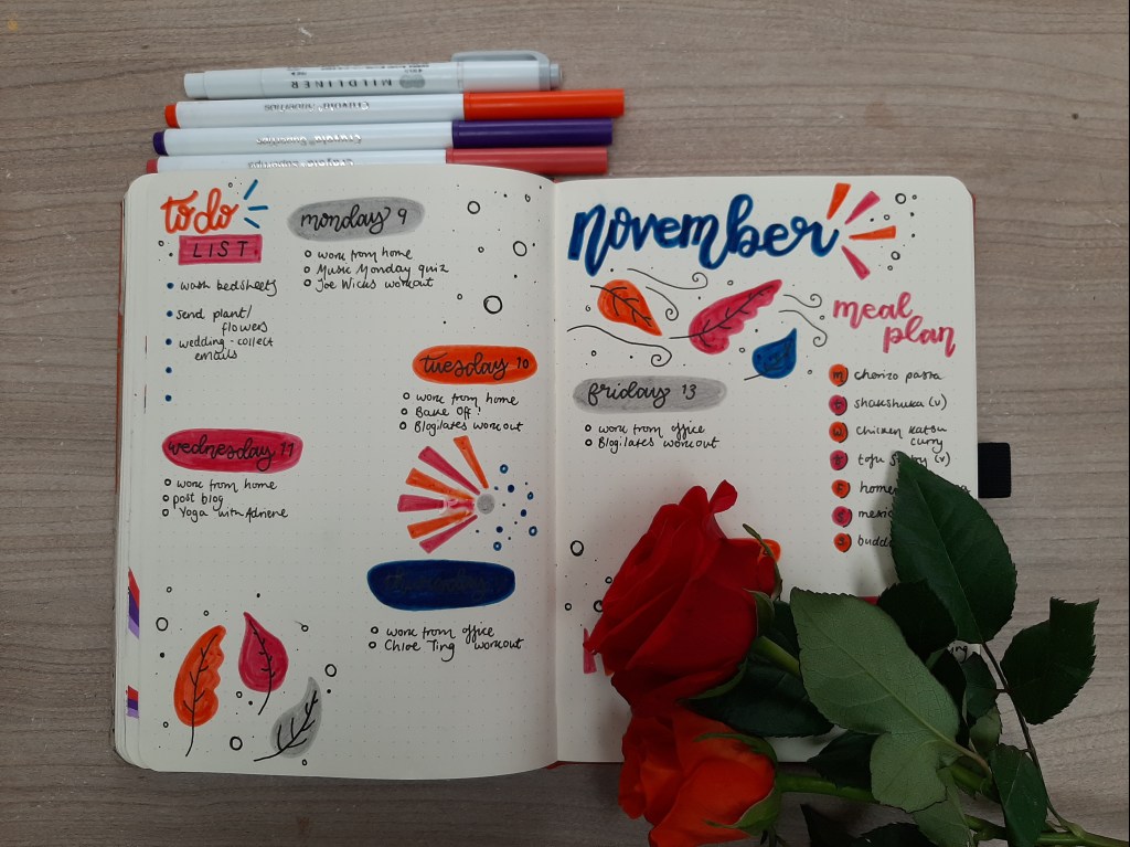
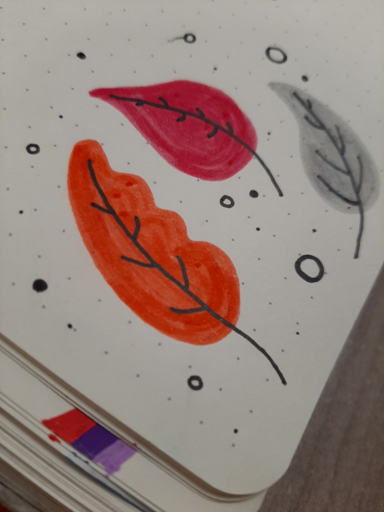
If the first spread was all about bright colours and lines, then my second week spread is all about jewel tones and curves (please do excuse the splodge of plant water on the page, I only noticed it after I took the photos!). There’s something about me that adores autumn, so I find myself drawn to drawing leaves and foliage as soon as it hits October. To keep in the colour theme, I chose to draw the leaves in the same palette, and it really paid off. Again, I let the colours do the talking here, kept it simple with a meal plan and (hidden) to do list, and created a warm but autumnal feeling spread.
So, that’s my November 2020 bujo in a nutshell; depending on how I feel on Saturday, my designated Art Club day, we’ll see what colours and themes I bring into the mix for week three of spreads! Do let me know in the comments what you think, and drop me links to your bujos. I love looking for inspiration on Pinterest and Instagram so drop me your faves.
Rosie x
Instagram | Twitter | Pinterest | Bloglovin |
Educate & Donate: Stephen Lawrence Charitable Trust | Stonewall UK | Survivor’s Trust | Mind |

Leave a comment